Tuesday, 15 December 2009

Images used on double page spread.


This is the original image i took, and i have used it on my doubl page spread.


This is the brigthened image, i altered the birghtnes and contrast of the image using microsoft office picture manager.


This is the image after it has been cropped, i once again used microsoft offic picture manager to crop this image.


This is the image once i have blacked out the background, i did this by using paint, i did this so the picture stands out on my double page.

real double page


This is my first attempt at my double page spread i am quite pleased with it but there is a coupl of areas i am going to improve upon.

I am very pleased with the layout, i think this works well as it is very imformative but still interesting due to the amoutn of visuals i have include, i think the pictures work well as there is a rang of different photos from a range of different shots, this is good because you can clearly see the band and who is who this is good because it advertises the band well.

From the feedback i recieved i found that the font colour used for the title was in the wrong colour and font style. this is not very good as it does not link with the cover and contents, i thinki need to change this so it ties the 3 in together.

I think i also need to add more colour to this page to make it more interesting and appealing, this is something i will do to improve upon my second attempt.


This is my second attempt at a double page spread, i am overall very pleased with this as my final piece.

I am very pleased with the layout of this and think there is a good mixture of informative text and visuals, after recieveing feedback i did not change the layout as they thought the layout worked well and was interesting but still information.

After recieveing feedback i changed the colour and font of the title this enables the double page to link in with the cover and contents, this is good because it links the two together.

Another thing i changed was the colou of the questions asked in the interview, this is good because it makes the questions stand out, this enables the readers to quickly scan the questions to find which ones they want to read..

Tuesday, 8 December 2009

Double page layout design


This is my first double page layout design. The layout is quite busy and contains a good mixture of visuals and text.

There isnt many photos included and this is something i will improve upon in my second layout design.

The articles featured on this page is a good mixture, this is good because it enables you to meet the new band, and feel like getting to know them, this is good because as they are a new band you feel like you know them allready.

This layout would work well because it enables readers to meet the new band through both visuals and text.


This is my second layout design, i think this layout works well because there is a good mixture of text and visuals this is good because it makes the layout interesting and informative.

There is a selection of pages in the middle of the pages, this is good because it uses a mixture of black and white, and colour pictures, this is good because it enables the readers to see the band from a number of different shots.

The featured articles used, enable readers to meet the new band and find out information about them, the articles used are both fun and informative, there are random facts, photos, and question and answers, this makes the page more interesting and informative.

This is my chosen double page layout design.


q double page spread


This is a double page spread from Q music magazine, Q is a monthly music magazine.


The layout used is not very interesting or imaginative, the picture used is big and bold and you could clearly recognise the artist if you was into this genre of music.


The layout used is taken up by 50% visulas and 50% text, this is a good mix as there is still a substantial amount of text used.


The layout used however is not very interesting, as there is only one picture,The photo used is a close up of kurt cobain, one of the featyured artists in this issue.


The colours used of black, white and orange are all quite natural colours that reflect the artists clothes, the colour used could have been picked out of his top, this is good is good because the plainness of the background draw attention to kurt cobain.


To improve this layout i would make the colour used brighter and bold, i would also add more pictures taken from a variety of different shots, this would add more interest to the page, and we would also be more aware of what the artist was like.

Monday, 7 December 2009

mix mag double page


This is a doublepage spread form mix mag music and clubbing magazine. Mix mag is a monthly dance and music magazine.


There are lots of photos included in this double page spread, around 80% of the layout is taken up by visulas, this allows readers to see who went to the event and where the event was, by just looking at the phtoos this ia good because it attracts a wider audience because the layout is less complex than most but it is still interesting.


The photos used are again taken from a variety of different angles this is good as it enables readers to seee the bands in a number of different shots and angles, this also adds more interest to the page.


The wiriting used is in diffferent colours, the font size used is quite small, this isn't very good as it is quite hard to read, so readers may not feel like they want to read the artcile.


The font colours used, eg black font on a white background, and white font used on a black background is good because it stands out and clashes against the background, this is good becaus e it attracts you eye to text making you want to read it.


The layout contains lot's of pictures this is good, because there is a good mixture of pictures and text.

Kerrang double page


This is a double page spread from kerrang magaizne, kerrang is a weekly music magazine.


One of the main pictures used of the whole band is taken form a long shot, this enables us to easily see what the band are like and what sort of genre they are from there clothes, this is good as it enables readers to easily determine whethere this is the right genre of magazine for them.


There is a wide range of photos used, the photos are taken from a range of different shots, there is alot of shots of the main singer, this advertises the band further, there are close ups, mid shots, and long shots of the lead singer, this makes the page more interesting, and the audience are more aware of the band.


Around 70% of the layout is taken up by visuals, this is good as it makes the page more interesting to look at, and less complex to follow, this would persuade more readers to read the article because it is more interesting to read and to look at.

This layout contains a good balance of pictures and text this is good because it is very imformative and interesting.

The writng used for the main article is in white font, this is good because it stands out well against the black background, and your eye is attracted to the writing beause of the contrast between background and font colour. The font size used however is quite small, this is not very good as some readers may find it hard to follow, and may think it will take to long to follow.

Friday, 4 December 2009

image manipulation-Front cover image


This is the orignal image i took using my camera. I decide to take a mid shot of my band, as you can easily see the members and it will fit well on the cover.


This is the photo after i had cut it out using GIMP, by using a plain background i could easily remove the background. By removing the background, it allows the band to stand out and become more predominant.


This is the photo i used for my cover, i changed the background to black, i used the photo with the white background first, but it didnt link with the contents very well.
i changed the background to black by doing this it tied in with the contents page and linked the two together.

Images i have used- Image editing. CONTENTS PAGE PICTURE

This is the image used on my contents page.


This is the original image, taken from a low angle mid shot.


This is second stage of the image editing, this is the image after it had been cropped, i used microsoft picture manager to crop this image, it think this makes the picture look better as it frames the band better.


This is the third stage of the image editing, i used microsoft office picture manager to alter the contrast of colours and darkness of the image, this has made the grafiti stand out which draws attention to the band.


Thursday, 3 December 2009

Magazine-contents page.

This is first front cover deign, over all i am very pleased with this, the main photo used is a low angle mid shot, i think this image works well as the main imgae, as the colours of the graffiti in the picture make the picture stand out against the background. By using a mid shot low angle it enables us to eaisly see the stars of the band.

The font, used for the word "contents" works welll witht he background, this is good because the pink stands out well against the black.
The picture used of the cover is good as it enables readers to see a link between the contents and cover.
The font colour used for the features is good because the colour are bright and bold and stand out against the black of the background, this is goood, as readers can easily read the features !


This is my second cover, i didnt make any changes really, because from the feedback i recieved, i was told it worked well.
i was told the font colours and styles worked well witht ht background, this is good as it is important for the test to be readable, from my feedback i am told it is readable.
I was told the picture of the cover should be changed to black to fit in with my updated cover, i change this and now feel my cover, and contents fit well together.
The font used for the main headings are big brigth and bold, this is good as it stands out against the black and makes you read more closley to look at the features.


Magazine-Front cover.


This is my first front cover i made, i chose a mid shot for my main photo,i have chosen this as most photos on magazine covers, are taken from a mid shot, this is good as it easily enables readers to easily recognise who is on the cover.

The white background used for my cover was not a very good choice, this makes the cover, look to blank and empty, this is not very good, as the magazine would not stand out. for my second design i am going to change the background colour, as i think it will improve the colour, and will appeal to more people.

The font used for the title, is good, as it stands out, and is bold, so it can be easily read, this is good as it enables readers to easily see the names.

The text used, for featured articles is both ood ad bad, the font used works well a it is bigger enough andd bolder enough to be readable, i think the font layout could be change so it can be read easier, but it could also be easier to read once the bakground colour has beeen changed.


This is my second improved cover, i made the changes after feedback i recieved. The photo used is taken from a mid shot, the photo stands out against the black background, which is good as it enables readers to easily see who the featured band is.

The black background used for my cover, works well, and looks better than the white, the black makes the photo's and text stand out, this is good as it enables readers to easily see who is featured and what storys are in this magazine.
The font used for the title works well against the black background, this is good because the pink stands out well against the black, and alos the font is big and bold, this again draws attention to the name, which is good as it is more likely to be remembered.
The text used for artciles and features is again good, the colours work well against the black background, this is good beause you can easily read what the articles listed are. The text used on the cover, works better on the black back ground rather than the white, this is good as it stands out better and is more predominant.

Tuesday, 1 December 2009

cover-layout design-music magazine.


This is my first cover layout design, aroung 70% is taken up by visuals, this makes the cover, seem interesting and appealing.

I have chosen to use this layout for my cover, i think it is quite interesting, and contains a good mix of visuals and text, it is easy to find the features that are in bold text and will stand out against the background and pictures.

The title is located at the top, underneath the picture, this allows the picture to stand out as the main feature andd advertisement, this is good as it enables the feature band, to be the main feature, and the main purpose of advertising.

I think this layout will work well, as there is a good mixture, of pictures, and text.


This is my second front cover layout design around 70% is taken up by visuals, this again allows readers to easily figure out what the main features are.
I have chosen this layout because it contains a good mix of visuals and text this allows readers to easily know what is going on in the magazine.
This type of mixture of text and visuals is used quite alot, this is good kayout techicque.
The title is agin located at the top of the page, above the main picture, this allows the main picture to stand out, and also the smaller picture.
This layout is quite simple and plain, it may not be very appealing to readers, i have chosen to use my first layout design as it is more interesting and has more going on, layout 1 also has a good mixture of text and visuals.


Monday, 30 November 2009

music magazine- contents page layout ideas.


This is my layout design, i think it is a good design, as there is a large picture ofthe main bnd, which is good, becuse it advertise them well, there is also a picture of the front cover linking the cover and contents together.

There is a a banner saying"in this weeks hype" this is good as it enables readers to find easily where the features are listed.

The bold text used for bands/artists is a good idea, as it enables readers to scan the text to ind bands they like.


This layout is goood, becaus the layout is taken up by about 50% visual this is good, as it makes th cover more interesting.


This is my second contents page layout design, around 40% is taken up by visuals, this is both good and bad, because it draws your attention to the pictures, but bad, as there is still alot of writing used.


Their is features listed both sides of the main picture, this is good because it attracts your attention to the main picture and the features, this is also bad because as the features are just listed, this means it is harder to find features you want to look at, meaning you have to scan all of the features to find the band you want to read about.


There is also features listed at the bottom of the screen, this again means the reader has, to search through all the features to find, the one feature they want to read.


There is a small picture of the front cover, again linking the front cover and contents page together, this enables readers to find out where main featured articles are located.


I have chosen to use layout 1, as it contains a good mixture of visuals and text.

Friday, 27 November 2009

Planning-music magazine- Name ideas.

HYPE-The connations of this could mean exciting and new, this could be a good idea for a name.

Sound- The connations of this could mean, music, or great/good this could be good, as it again symbolises music, and good.

NOW Music- The connations of this suggests up to date music is featured, this would eb a good name as readers would by it for the up to date music features.

Future Stars- The connations of this suggests, uFuture artists to hit the music industrie, this would be good, as it would advertise new bands.

My chosen nmae I hipe, i have chosen this because it suggests, exciting and new.

Wednesday, 25 November 2009

planning-music magazine-kerrang contents


This is the contents page from kerrang magazine, kerrang is a weekly music/gig magazine.
The colour scheme used is black, white, yellow, and a little red, this colour scheme is the same as the cover, this is good because the continuos colour scheme is kept, linking the cover and contents together.
The layout of the page is rather full and busy, around 60% is taken up by visuals, it fills the page but does;t take up space for the information, this is also good as you can easily link to who is staring in the magazine, this makes it easy to tell what genre of music this magazine is aimed at. from this cover i can tell this edition is aimed at more rock to heavy metal fans.
The main picture is of behemoth, they are a heavy metal/ rock band, which fits the target audience, the shot is a mid close up, this shot captures the band head on, meaning fans should easily recognise them.
The font used is simialr for everything, however some is in capitals and is bold, and some is in lower case and not bold. This is a good techniqur because all artists/bands are in bold, so they stand out this is good because you can easily tell which artists are in this magazine.
The layout used is a good way of balancing both words and images effectively, it is easy to see who is in this magazine and what page they are on, from the pictures and text used, also they are placed in order of importance for example the main band featured is above the other artists, this is a good way of advertising the main band, as they have the biggest picture on the contents they are more likely to be remembered.

planning-music magazine-mixmag contents


This is the contents page from mix mag magazine, the main picture on the contents page is of what looks like a party/club this is a good picture to use as the magazine is a music and clubbing magazine, so this picture fits the audience perfectly. The photo is taken from a birds eye view angle, this ios good as we are able to see what is going on.
The text used is in white and yellow, this is good because the writing stands out, on the black background, the black white and yellow goes quite well together, and reminds you of lights in the dark, therefore reminsing you of a club.
however the font size used is very small listing the features and also the writing at the bottom, this is not very good as some readers may find it hard to read, this is not very good as you have to read it closely to understand what is typed.
The largest font used is on the picture ~"59" this is good because it draws your attention to the picture, by looking at the picture you can work out what the picture is adverting, this is good because by seeing the large 59 it has then drawn your attention to a featured article.
The layout of the contents page is good, the picture in the centre attracts your attention, meaning you are reading the text below, the features listed on the left hand side of the page are not advertised well, this is not very good as the word "features" is not very big or bold, the features are in bold which is a bit better as it attracts your attention to the features.
The mian colours used are pink,white,yellow and black, this is a good colour scheme for a clubbing magazine, as it comes across quite funky, modern and quite club like in a way, as it could symbolize the darkness of a club, and the whites, yellows and pinks of the clubbers and the lights, this is quite a good idea, as it fits the target audience perfectly and is a good way to advertising clubbing.
The cover picture is placed in the right hand corner of the page, this is good as it has a large 50 on top of it saying celebritiy dj's this is good as it is again advertising the djs that you can find on page 50.

planning-music magazine-Q contents


This is the contents page from Q magazine, as you can see it takes up a double page. The colour scheme is again, red,white,black and green, as used on the cover, it is good the colour scheme ha been continued, because it means the contents and cover fit very well together.


The frnt cover of the magazine is placed in the right hand corner, this is a good idea because it allows readers to see the connection between the cover and contents.


The font used is the same for everything, the page numbers on the pictures are in the biggesr font, this is god because it means can easily fidn out what page for example green day are on, this is a good idea as it enables you to easily find featured artists rather than looking through the whole magazine. The font size used on the pictures varies, this is not very good as some ages dont stand out as well as others,


The layout of the contents is good, as there is two collumns listing some of the articles this is good as it enables some readers to read descriptions in mor detail. The way the pictures are placed in the centre of the pages is a good technique, as again you can easiy see what articles are included.
The photos used are of several different artists, taken at several different shots, this is good as we are able to see a range of differnt artists, this also enables us to easily recognise what genre of music this magzine is focused on.

Planing-Music magazine-kerrang cover


This is the cover from the music magazine Kerrang, kerrang is a weekly music magazine.
One of the advertising points on the front cover is, "The uk's Biggest gig guide" this is a good thing to have as it enables the reader to know what is in this magazine, by saying it is on of the biggest gig guides it means that readers who would like to know about up and coming gigs would probably buy this magazine, to find out what gigs wre up and coming.
The colour scheme of yellow,red, black and white used on the cover is good as it makes the features stand out against the grey background, this is good as you can easily see what is in this magazine.
The font used on he cover is the same, the title is in the biggest font, this shows its importance and enable the reader to easily see the name. Key words in the articles are in bigger bolder text and the explaination underneath is in a smalleer less bold text this is good as the readers can easily see who i in the magazine, this means they dont have to read through loads to fdn out what is in the magazine.
The main picture used is of a white young male, framed as a low angle close up, this is a good shot as it enables the readers to see the males tatoos and peircings they can then tell, that this magazine is a more rocky sort of magazine. The other photos used on the cover, are some other rocky artist's, this is good as it enables us to quickly know that this magazine is vey much a rock magazine.
There are lots of different pictures, artsists names fonts used on this cover, this makes the cover seem very busy, this is a goodand a bad thing, it is good as it enables you to easily see who is in the magazine, it is bad as some of the text is hard to read because theres so much else going on.

Tuesday, 24 November 2009

planning-Music magazine-MIXMAG cover

This is a front cover from mix mag magazine, it is a monthly magazine. It is "the world's biggest dance music and clubbing magazine"


The colour scheme used for this magazine is, Florescent pink, black and white, i believe this colour scheme quite a young colour scheme. Which i belive fits the genre of magazine,this magazine is a young adult magazine, as it is a music and cubbing magazine.


The font used is different for each item, the magazine name is in large Florescent pink text, this makes the name stand out, this would enable the magazine to stand out from the rest as the name text is very bright, bold and big. I think the font size is varied sizes due to its importance. The title is in the biggest font, this is because it is important the readers can see tht title from a distance. "celebrity DJs" is another of the larger fonts on the cover, this could be because it is one of the important featured articles in this issue.


The photo used is of young, blonde female, taken at a low angle mid shot, this is a well framed shot as we are able to see her outfit, this lady symbolises the young lady, andas this is a clubbing magazine it fits the target audience. The picture of the DJ decks again symbolises dancing/clubbing, this again fits the target audience as it is a clubbing magazine.

Planning-music magazine-Q magazine cover.

This is the front cover from Q magazine, it is a monthly magazine, but also has special subscriber editions as well.

The color scheme used on this front cover is very simply, the red, green, black and white colour scheme used, is very effective. There is one back ground, block colour used, this makes the magazine logo stand out, and also the main image, it is a good way of making the image stand out, this is good as it enables us to easily know what band is the main featurein this edition.

The logo is red, this is a contrasting colour to the background, this is good as it makes the logo stand out, this enables us to easily see the magazine name. The font used for the magazine title is very simple, this is good as it makes the letter "Q" stand out, the font it also very large and in capitals, this again makes the logo stand out. The fon used for the subscribers only text is in capitals this makes it stand out and draws our attention to the mesage, i think the choice of white writing was not a very good idea, as it makes it harder to read, this is not very good as you cant read what it says very well.

The picture used on this magazine is a picture, from a mid shot from a low angle of green day,This is a good shot to use for the cover, as it is well framed you are easily able to see each band member, this is good as you can easily tell who the magazine is about. The main singer of the band is at the front of the shot, this shows his predominance and importance. This is a good picture to use as you can easily see who the magazine is about.

The target audience for Q magazine can change slightly by who the cover stars are, i think for this edition it could depend, it would be suitable for both men and women that are a range of different ages. I think for this issue it would be suitable for men and women, at a range of diffrent ages.

Friday, 20 November 2009

Preliminary task- Magazine


This is the front cover i made for the preliminary task, i think this went reasonable well, as it looks like a cover.

Things i that went well is the cover scheme, i think this refelects the target audience of a school magazine.

Things i could improve on, can be the layout of the magazine, this can be improved by, adding more than one image, this would be good as it would enable readers to know what else is inside the magazine, this would also make the cover more interesting to look at.
Another area i could improve on, can be the main image, this could be improve by instead of using one solid image, use a image that sits in front of the text.


This is the contents page i created for my preliminary task, it think this went reasonably well.

I think there are several things i could improve on, one of the things i am going to improve upon, is the layout of the page, after research front covers, i have noticed that instead of listing most articles, there is just a list of sevral article, and pictures adfvertising the others, i would use this in my contentes as in most contents 60% is taken up by visuals, this also makes it more interesting to the readers.
Another thing i would improve upon would be again to place images in front off certain text, this would be good as it would look more proffessional.


Friday, 6 November 2009

Planning-promotion video

This is my 3rd story board
This is my second story board.

this is my first storyboard.


this is my first inital brainstorm which i created to think of an idea.


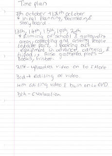
this is my time plan.


Thursday, 5 November 2009

Media evaluation- Promotion video

Guilsborough school promotion video

How have you appealed to your target audience.
My target audience was new pupils for the school, this could be either new year 7's or new sixth formers. I think my promotion video is more aimed at new sixth formers, as it shows areas of the sixth form and personal views from fellow sixth formers. i think my promotion video shows a range of different shots from a range of different areas from around the school, this makes it easy to see different areas of the school easily, which means it is a good feature and would be useful for new sixth formers. I think this video would be good, used in school to shows new sixh formers as it shows areas from around the school, so it is an easy way to view areas of the school, and hear peoples views on the sixth form, i think my video fits well for my target audience as it captures shots of the sixth form and school, which sixth formers would be interested in seeing .

Whats technical skills have you developed during this process.
I think i have developed technical skills in the way in which the cameras work, and the way to create a range of different shots whilst still keeping the camera steady, this has enabled me to get the best out of the camera, which has meant i have eneded up with a film that has contained a variety of different shots, that are all still and are focus. I have also developed more technical skills in the way in which to use i movie and also how to edit my film, this has enabled me to cut the best bits of my filming i wanted to use, which has meant i have ended up with all the shots i have wanted to use. i have also developed the skills to do with sound which has meant i have been able to remove some of the background noise from my shots, which meant i have been able to use all the shots i wanted to. i have also been able to add a song to my film which has made my film more interesting to my target audience.

How have you represented social groups and places?
I beleive i have representedf guilsborough school well, as i have included a variety of shots from around the school which enable viewers to see a true acount of the school, and the facilities that are around here, this also means new pupils have an idea of what the school looks like before they come here. As i have useed shots of pupils i think this gives the impression that the pupils are friendly and that they enjoy the school, i think this is a true account of the pupils i used as most of them are friendly. I also used people opions of the school i belive this are true representations of there true opions as they decided what they wanted to say.