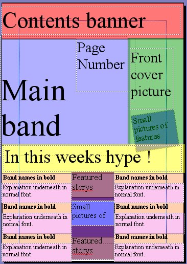
This is my layout design, i think it is a good design, as there is a large picture ofthe main bnd, which is good, becuse it advertise them well, there is also a picture of the front cover linking the cover and contents together.
There is a a banner saying"in this weeks hype" this is good as it enables readers to find easily where the features are listed.
The bold text used for bands/artists is a good idea, as it enables readers to scan the text to ind bands they like.
This layout is goood, becaus the layout is taken up by about 50% visual this is good, as it makes th cover more interesting.

This is my second contents page layout design, around 40% is taken up by visuals, this is both good and bad, because it draws your attention to the pictures, but bad, as there is still alot of writing used.
Their is features listed both sides of the main picture, this is good because it attracts your attention to the main picture and the features, this is also bad because as the features are just listed, this means it is harder to find features you want to look at, meaning you have to scan all of the features to find the band you want to read about.
There is also features listed at the bottom of the screen, this again means the reader has, to search through all the features to find, the one feature they want to read.
There is a small picture of the front cover, again linking the front cover and contents page together, this enables readers to find out where main featured articles are located.
I have chosen to use layout 1, as it contains a good mixture of visuals and text.

No comments:
Post a Comment